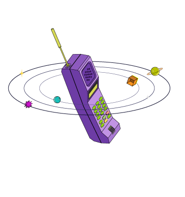
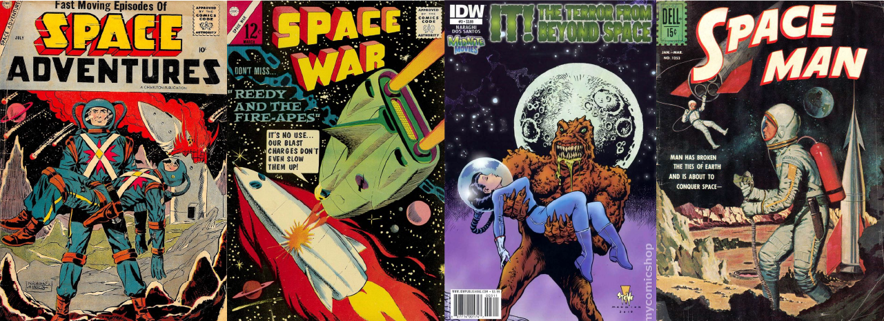
Moodboard: What's more iconic than retro sci-fi comics when it comes to outer space graphics?
Client: Crater.club
Role: Head of Visual Design
Design Synopsis: Art Direction, Product Visualization, Mapping User Experience
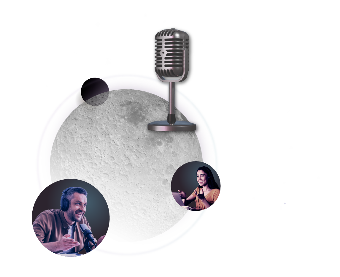
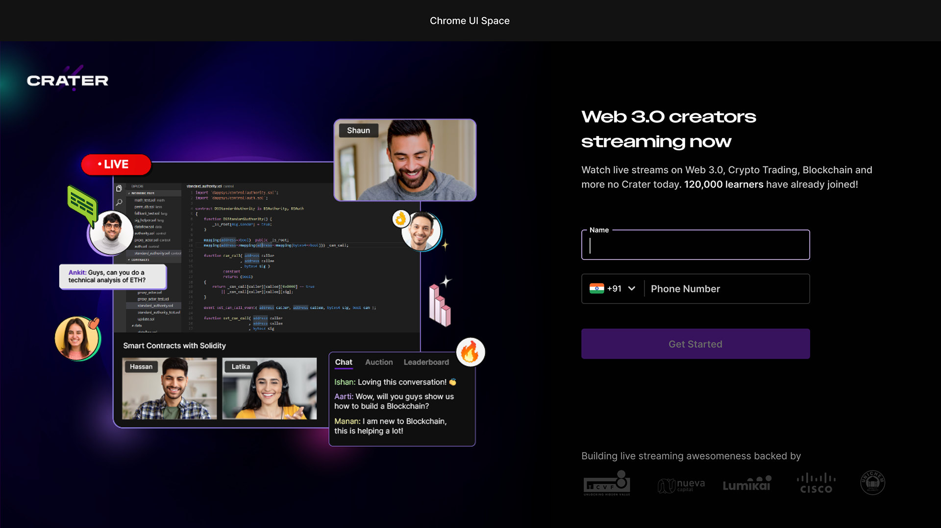
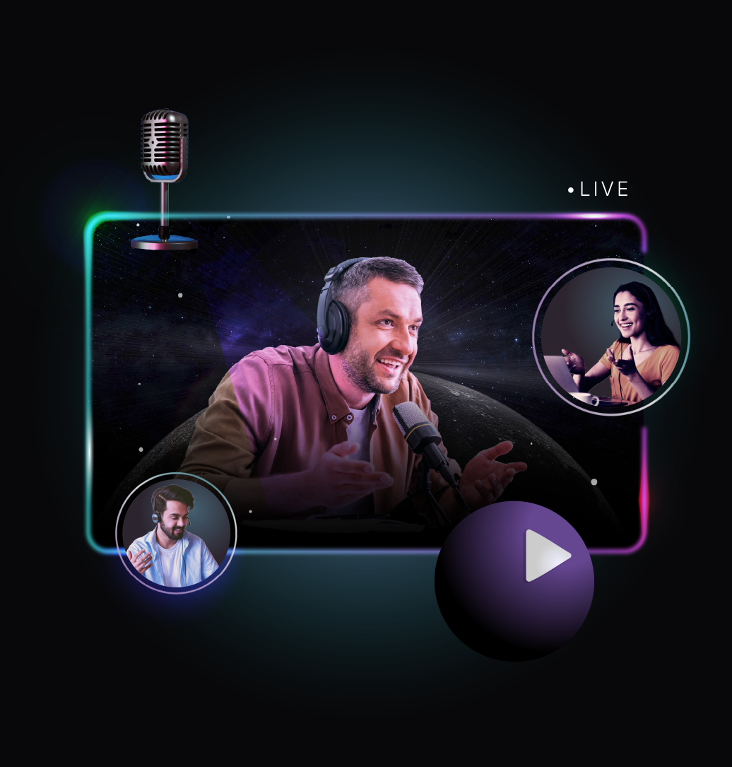
Background: Crater.club is a live streaming and monetization platform for creators to share knowledge through live streams. We wanted to build visual storytelling experiences in the user journey that boosts feature discovery.
Role: Head of Visual Design
Design Synopsis: Art Direction, Product Visualization, Mapping User Experience
Background: Crater.club is a live streaming and monetization platform for creators to share knowledge through live streams. We wanted to build visual storytelling experiences in the user journey that boosts feature discovery.
What if we emulated the excitement of space discovery for feature discovery?
As a brand that is rooted in connotations of outerspace, we wanted the user journey to resonate the experience of space exploration - curiosity, learning, discovery and possibility.
Back in the mid-1900's when space discovery began, its interpretation in comics and posters was not considered high-art, however popular. It was produced on newsprint paper with halftone dot textures and 3-4 flat colours, giving them a signature style. Another cool technique is their use of dramatic perspectives and foreshortening to emphasize great distances and speed.

Moodboard: exaggerated perspectives and clean shapes.
The User Journey for the creators was divided into 9 stages over which they could go from being a first-time streamer to an expert content-creator unlocking monetization opportunities and premium product features.
Creator Journey Graphics

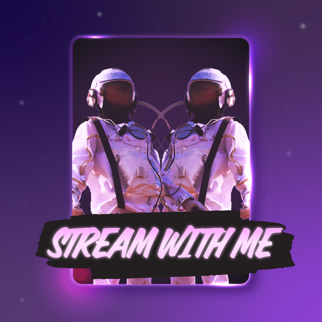
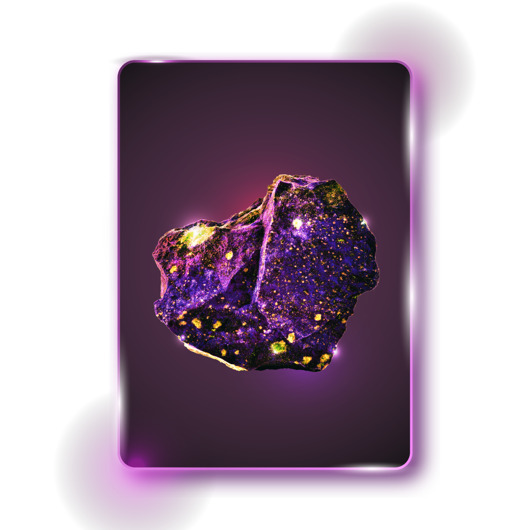
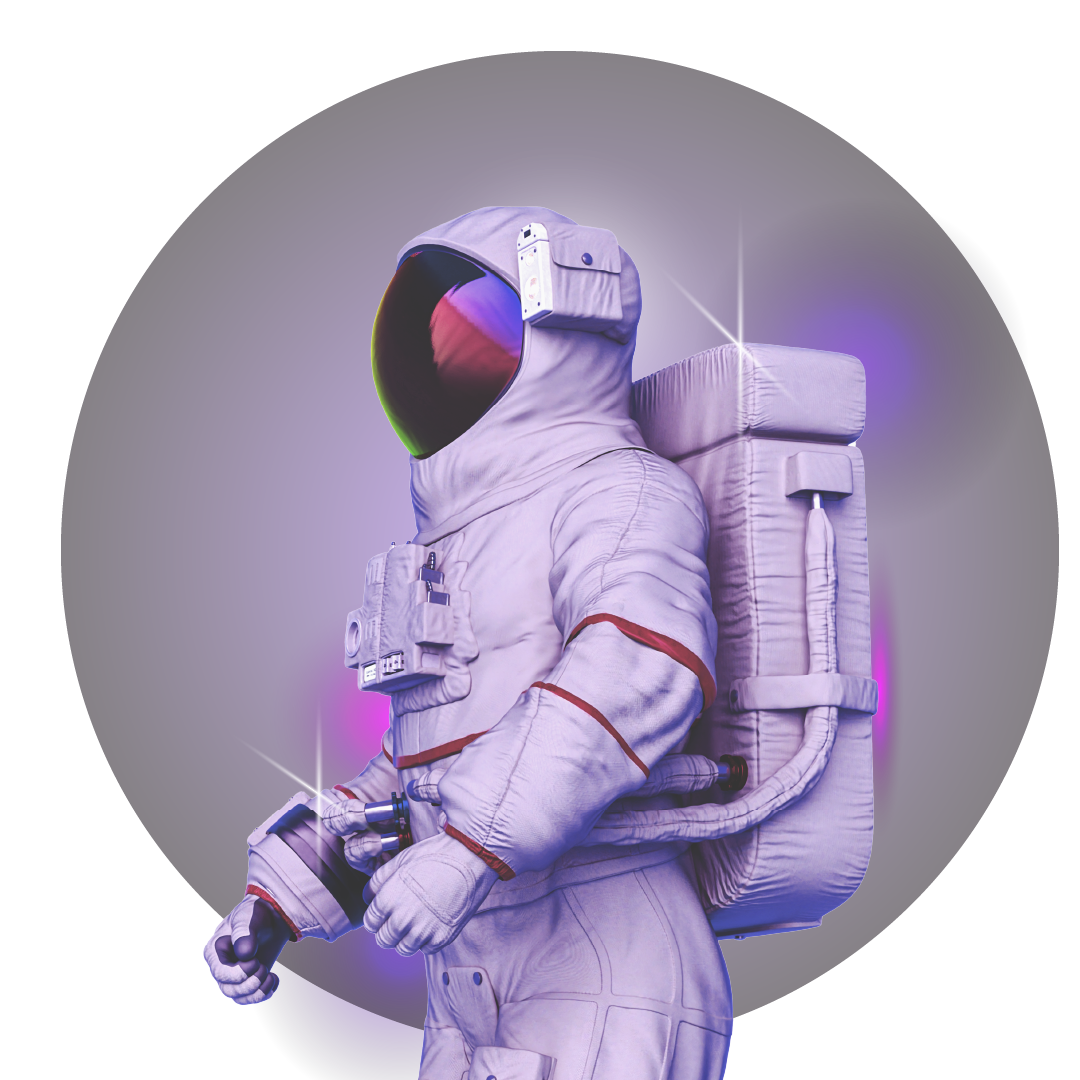
For the viewers, we created Bounty Cards that were rewards that could be unlocked for bonus interactions with their favourite creators. We put the user in the shoes (and suit) of an astronaut chancing upon new realms.
Bounty Cards for Viewers
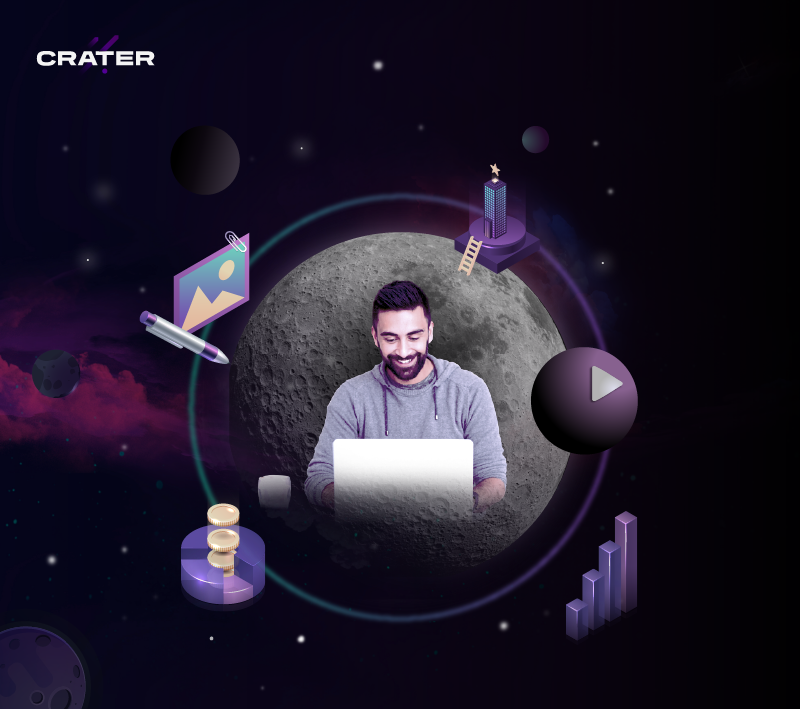
Product Visualization for Web & App
We extended this visual style to the product graphics such as empty states, headers and splash screens.
We extended this visual style to the product graphics such as empty states, headers and splash screens.


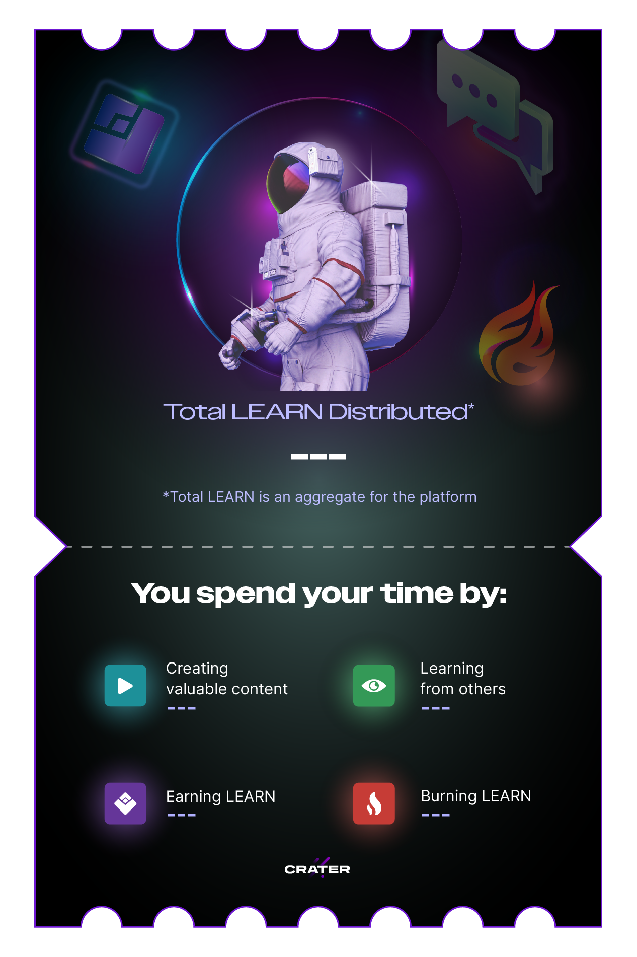
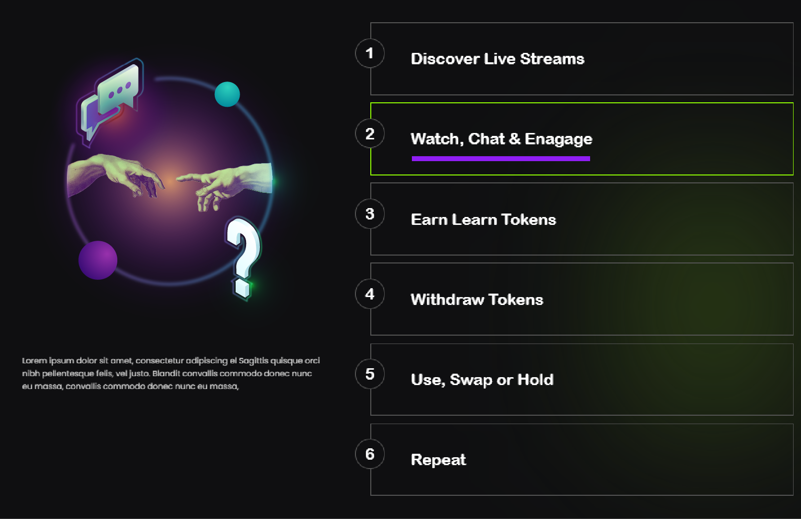
Launching LEARN Token
Crater partnered with Blockchain Bulls to launch LEARN token, on the Binance Blockchain. LEARN token can be paired with the Metamask wallet and it cna be earned by creating and consuming streamed content on Crater.


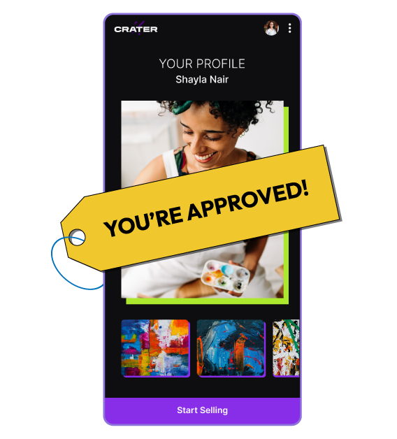
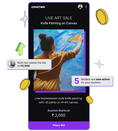
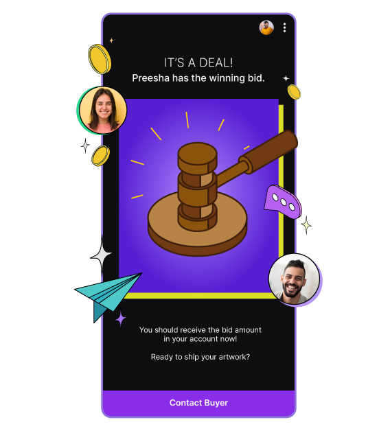
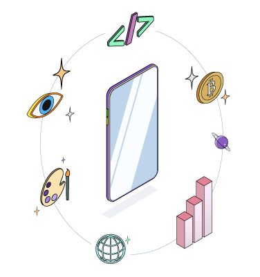
Adapting to the Neo-Pop Design System
When Cred launched its Neo-Pop UI guidelines, Crater took inspiration to test them on their User Onboarding screens and Monetization feature with brighter colours and isometric graphics.